xRay Redesign - DVR Feature Completed Q4 2021
Problem Statement
Advanced support engineers need a fast & easy way to solve residential customer problems to ensure our customers stay connected with their content.
For DVR, users needed an improved way of understanding usage on the account and discrepancies between Cloud and Device storage when both were present on a residential account.
Vision
Empower advanced support engineers to solve X1 customers' problems faster and easier. Make our users fall in love with xRay all over again.
Value Proposition / Benefits
Reduce support costs by enabling users to identify and solve customer problems faster.
Reduce user fatigue by making data easier to access and read.
Well-being. Users feel more empowered when solving problems is faster and easier.
Multi-tenant design maximizes market potential
Personas
Front line troubleshooter – Day of job (DOJ) in Technician Support Center (TSC)
Advanced troubleshooter – Senior & Lead TSC
Advanced customer care – Tier 2 & 3 Customer CARE agent NCOE
Engineering – Regional engineering & division engineering

Feedback from xRay users about the success of the DVR and Channel Line-Up redesign. Positive feedback for V2 was received throughout the redesign of xRay.
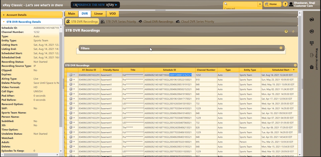
Original xRay
The original xRay application that was designed in 2012 is shown below. The video and images both show the DVR section of the application.
STB recordings and Cloud recordings are listed separately. To know if a recording has been stored in both places, one or none, a search needs to be conducted in both sections to confirm.
The Series Priority sections are also duplicated even though a user only selects one priority if they do set it.
The table has more columns than can be seen at one time. The engineers decided to create a horizontal scroll. It is also possible to download the data to an excel spreadsheet. Neither method makes it easier for users to copy and paste data into trouble tickets when needed.
For each recording, there are additional details in the left pane. These details will only surface once a row in the table is selected. For new users, it is easy to forget or miss this data. It also adds to the application feeling disjointed and unprofessional.
Even more information can be accessed by clicking the gear icon in the 2nd column of the table. There Recording History and the Conflict Visualizer can be found. The Conflict Visualizer in V1 is a visualization of recordings and will show when there is a conflict that will prevent the scheduled recording from completing. Most of the time, the visualization displays that everything is fine and running smoothly. Therefore, it is mostly unnecessary. For Cloud recordings, you can also find Recording Validations for some recordings under the gear icon.
Search filters are extensive and some are not used. There are no search capabilities within the table itself, but there is some sort functionality.
Most Needed Change
Understanding the needs of the troubleshooting scenario and use case, it was obvious the biggest need was to combine Cloud and DVR recordings and call out discrepancies as well as make a clear and appropriately placed visualization of how much space was currently consumed.
xRay V1 DVR


The Conflict Visualizer is accessed through the gear icon in the second column. Because there were now many more tuners available for recording, it became less likely that there would be a recording conflict. Thus the Conflict Visualizer was a lot of effort for little reward if we were to rebuild it. I pointed out to the Product Owner and developers that we could surface data only when there was a discrepancy and show the pertinent data in a table. Thus reducing development time that would have been spent on rebuilding this type of visualization. It is great to visualizations where possible with data intensive applications, but not everything will have the same amount of use and ROI.


Solution
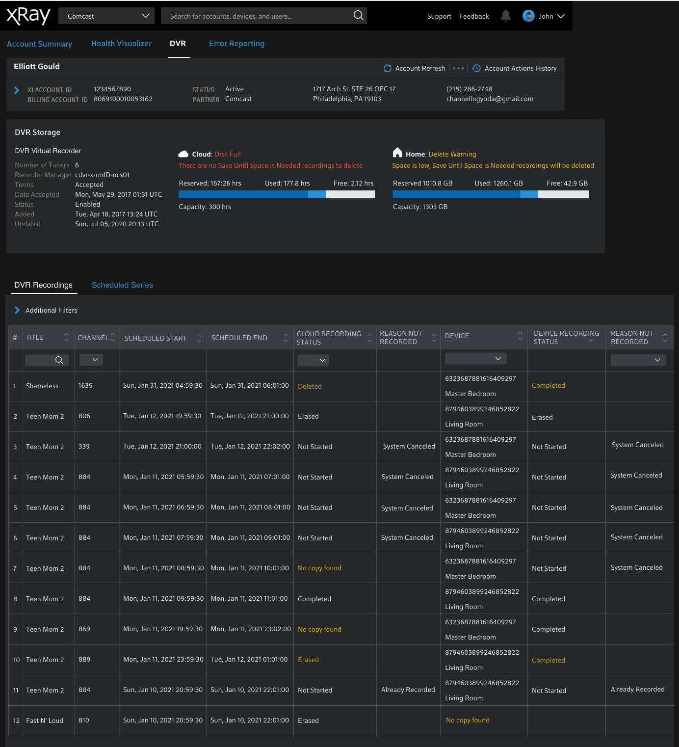
The DVR feature in xRay V2
combines both DVR and Cloud recordings in one table
displays one Series Priority
displays visualization of Cloud and Device storage on DVR page
translated the Conflict Visualizer into a table and only shows Conflicts when it jeopardizes or has prevented a recording
all additional information formerly shown in the left pane or through the gear icon are now displayed in an expanded row under the primary row with information about the recording
prioritizes the visibility of key information most used for troubleshooting in the main table
Cross-functional Collaboration
Our Architecture Lead gave me the critical information needed to get started. How do these tables relate to each other? Without understanding how they were technically structured, I couldn’t know that these groups had a way to relate with each other. I needed to know it could be done before spending time on how it would be done.
The Cloud and DVR recordings were linked by their Schedule ID. Based on that I was able to remove the Schedule ID from the table, put that in secondary information and know that our Devs would have a way to combine them. Through talking with users, we also knew that 98% of our use cases would not require searching by Schedule ID.
I did not change much in the order of items for our first round of testing, but trimmed the table down to show what had been functioning as key items and put the rest in the expanded row section. I knew that users would give me needed feedback on which data points were most important and the most common troubleshooting scenarios. So I didn’t spend too much upfront time trying to figure it out. As well, I’ve found it generates more discussion with engineers when they find something “wrong”.
ITERATION 1


We gathered key findings in testing that I incorporated in ITERATION 2. As well, I experimented with options for displaying discrepancies between STB and Cloud recordings.
FINDINGS
Having numbers to the left was helpful in reading the split row that we were introducing. So I added them to the design officially. Originally they were added only to make testing easier when asking questions about different rows.
It made the most sense to list Title first as Advanced Care was most often answering questions about a missing recording.
Clipped was listed by one user as something they routinely checked. So it was added back to the table for the next round of testing.
Grouping the single cells and split cells made it the easiest to read and understand. This is something that I normally would have picked up in the first iteration except I was only focusing on chopping it down to size and getting feedback.
ITERATION 2

Design and development agreed that the yellow background brought significant attention to the discrepancy. However, the team and I agreed that the yellow text on a black background brought enough attention.
The design was in progress when the story was brought into Backlog Grooming/Refinement with the xRay development team. Some of the devs were concerned with the split row and wanted to see a mockup where Cloud Recording Device and Device Recording Status with their Reason Not Recorded were displayed in separate columns and made it easier for development. Iteration 3 was created because of this request and was brought back to devs and users for feedback.
ITERATION 3
When the Dev team saw this version they all agreed that it was more difficult to read and understand. This was the same feedback received from users. All agreed that the split row showing results for Cloud and results for DVR per recording was the simplest and easiest to understand. I’ve found it works best to mock up ideas from the team, even if I believe it is a poor idea. I will still be right most of the time, but I may be surprised or it may lead to other ideas. It also helps for others to see how their ideas would actually pan out. In this case, the dev team could see for themselves that wanting to make the coding simpler didn’t result in a better or even good solution.
ITERATION 4


In Iteration 4 I met with the Architect and Product Owner and we reviewed detail by detail which items would have the same data for a recording and which data points could be different. We the organized and listed them accordingly. We also “triple” checked that no data points were missed. In this sprint we were also adding Recording History to the expanded row.
We also agreed on a final version for how Location was displayed and using the label of “Location”. I advised using the Device Number first for Devices because alternating a number and word are easier for the human eye to differentiate while scanning.
ITERATION 5


In the final iteration, we added Recording Conflict data to the expanded row. In some cases, there will be a lot of information in this expanded row, but it is in a minority of cases. Most recordings will be successful and straightforward and will contain the top section of data points, and little data for Recording History.
The Conflict Visualizer shown above in V1 was changed to a table displaying the recording conflicts and pertinent details. As discussed above, recording conflicts happen less often now that devices and Cloud recording have 6 tuners. Care agents are interested in seeing the conflicts as well as why they are conflicting. It could be because all of the recordings are happening at the same time, or it could be because they are overlapping due to padding added to the recording. If that’s the case, agents can advise customers to leave out padding to make sure more of their recordings are successful.