Supply Chain Management Dashboard
Problem/Opportunity
Almac wanted to create a Supply Chain Manager (SCM) dashboard for their IXRS 3.0 platform to help them monitor clinical trial supplies more effectively. Their job is to ensure that sufficient drug is at the right place at the right time to meet subject needs and conduct the study in a cost-effective manner.
Previous Prototype (image below)
Almac Supply Chain Project Group Managers (higher level supply chain managers) created the dashboard prototype seen below the year before. It was a blue sky design of high level information that would be helpful to them. IXRS 3.0 would not have access to the production or distribution data needed to create this dashboard, since not all of Almac's systems were integrated. In addition, while this information is an excellent summary of the current state of the management of supplies for the trial, it would be less effective in helping the supply chain managers in their daily or weekly maintenance or check-in activities. This distinction was not readily apparent when I was first introduced to this document, but it became apparent during the course of more detailed on-site interviews with individual supply chain managers.

Current Study Dashboard (image below)
This is the current IXRS 3.0 Study Dashboard which does contain some supply data. It highlights some of the problems we were already facing with our graph and charting capabilities. In the Supply Metrics graph, you can see a 0 line in the middle. That was designed to represent the "threshold" for a particular supply. It was important to stay at or above the threshold to maintain an adequate supply. However, the way the information is displayed is confusing. It looks as if there is a negative number of supplies. It was done this way because the current graph library we used was not capable of "layering information," ie, stacked bars, or two types of information in the same place. In addition, this graph shows 6 depots and 3 types of supplies. In large trials there could be as many as 20 depots and 4 or more types of supplies. Therefore, we needed to be able to create more advanced types of charts and graphs.
Problems:
1) This information alone takes up the entire screen.
2) The supply inventory display was confusing to people and did not scale well for large studies with 20 depots. It also does not list what portions of inventory may be expiring and when.

Problem/Opportunity (cont.)
Early on Product Managers had conducted group meetings with a variety of stakeholders to gather a long list of requirements for the SCM dashboard that were incorporated into the first design. There was pushback from the technical side and our own Product Director as to the scope of the proposed dashboard.
Actions
I proposed individual interviews and concept/usability testing with 5 additional supply chain managers.
For the individual interviews, I went to meet with supply chain managers where they worked and presented a scenario “Let's pretend that I am joining your team and you have 2 hours to show me how you do your job.”
It was important for them to show me how they did their job, and not just tell me how they did their job or what they wanted to see in a dashboard. Human-centered design methods emphasize the significance of observing how our users work through various steps and how their tools and materials trigger more accurate memory of behavior and the variety of thoughts and feelings they might not otherwise have remembered or thought about.
With this information, I created very detailed personas of our supply chain manager and his assistant, the distribution depot coordinator. These personas can be viewed here. There were a few paths we could have taken with the dashboard and fulfilled some need for supply chain management. But if our goal was to impact the work of the SCM specifically, we needed to focus our efforts on the needs of that role. These personas were created purposely with a high level of detail to help us maintain that focus.
Results, Solution, Impact
After round 2 of discovery, our team had a much clearer picture of how supply chain managers managed complex trials and what factors could contribute to their complexity. We also knew more about their pain points, concerns, and the pros/cons of the IXRS 2.0 dashboards that were still in use.
The SCM job is very complex. They use huge spreadsheets to copy and past information into and track a number of metrics over the course of the trial. We were not creating a game changing tool to replace their current process. Our focus was a high level dashboard and we needed to define clear goals of what specific problems we were trying to solve.
Based on that, I proposed a dashboard that answered the following questions which were a priority for supply chain managers and solved them in a way we could efficiently address for our MVP.
1 - Where do we have active subjects?
It was not readily apparent where there were still active subjects, especially when trials were winding down. SCM needed to know which depots were still serving active subjects.
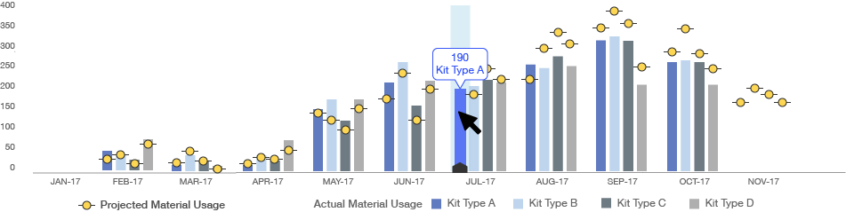
2 - How are we doing against what we projected?
How are projections matching up with demand. This they wanted to know on an end of month basis and see how well they met that monthly goal over the course of the trial.
3 - What exactly is expiring?
SCM could see that there are 18 of Kit Type A at the Craigavon depot, but they wouldn’t know if any of that was approaching expiry without digging into a report.
As things progressed, it did not look like we would have our technical problems with graphs solved in time. Almac was having financial difficulties and getting approval for new tools was at a stand still.
So we agreed to go forward with the dashboard shown below. It would provide SCM with a high level view of supply at depots, what the enrollment metrics were related to each depot as well as shipment information, and what was expiring over the next 9 months.

Phase 2
I had researched and proposed purchasing 3rd party software from Amcharts which would allow us to build the next stage of the Supply Chain Manager Dashboard and incorporate the display of projected usage versus actual material usage over the course of the clinical trial. Prior to that we were unable to create graphs that had more than one layer of data. This would be a major step towards providing the SCM's with one thing they really wanted - supply chain information shown over time.
I also met with our Technical Director and Product Director to discuss the feasibility of using this tool or other 3rd party software on our platform and the likelihood of getting budget approval. It was important to know what our capabilities could be in the future and to communicate to these stakeholders that our product and competitiveness in the market would be compromised if we weren't able to upgrade our data visualization tools soon. Supply Chain Managers needed to visual their data over time to see trends in enrollment and distribution in order to get the most value.

This graph would allow the SCM's to see how projections were matching up with demand over the course of the trial. The screenshots below show some of the details the would be shown within the graph.